Part 4- Research point 1

I thought I would start this research point from the very basics and then begin to delve deeper and extend my research. I first began with a very simple definition of yarn.

Yarn- Definition from http://www.thefreedictionary.com/yarn

  • A continuous strand of twisted threads of natural or synthetic fibres, such as wool or nylon used in weaving or knitting.
  • A similar strand of other materials such as glass or plastic.

Alternative definition from http://www.merriam-webster.com/dictionary/yarn

  •   A continuous often plied strand composed of either natural or man-made fibres or filaments and used in weaving and knitting to form cloth.

It is interesting to read a basic definition of the word yarn because when I think of yarn I think of so much more then it just being a fibre that is used to make something else. I get excited but maybe that is just my love to textiles and 3D linear qualities.
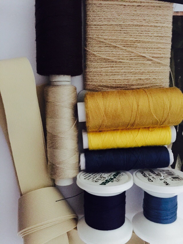
Yarn Fibres

The most common natural fibre used in yarn making is cotton, this is then usually spun into a fine yarn which can then be used to create something else such as cloth or knitting. The most common synthetic fibre is polyester, it is drawn out from polymers derived from natural gas and oil. Synthetic fibres are usually continuous strands of gel-state materials which are then stretched (drawn), hardened (annealed) and cured to obtain the desired properties. Synthetic fibres usually come in three basic forms:

  • Staple- cut fibres generally sold into lengths of up to 120mm
  • Tow- Continuous rope of fibres consisting of many filaments loosely joined side to side
  • Filament- continuous strand consisting on one filament to many

Filament extraction is referred to as spinning and most people then associate this with this with spun yarn production.

The most common spun animal fibre is wool which is harvested from sheep and then reproduced into ‘rougher’ fibres for things such as knitting and crochet. There are also many other animal fibres and they are commonly used due to their qualities which allow them to trip a great deal of hit heat which makes them very warm fabrics. They can trap heat as they are slightly elastic and very breathable.

The definitions above don’t quite cover all that yarn can be used for as both mainly mention the use of yarn in a decorative sense rather than a practical fibre when in actual fact it is used in many technical household items. Not only household items but also those more industrial items for mechanical machinery and various other uses. I investigated further below.

Although natural fibres  can be wonderful to use they tend to require a lot  more monitoring and labour to keep them in the right conditions and as they have the capability to shrink, wrinkle, strain, fade, stretch and be eaten by moths more commonly then synthetic fibres. This then means special treatment have to be used to try and prevent this.

It is very common for synthetic and natural fibres to be combined to create a product that inherits the properties of both of its parts. This then means the negatives of each fibre can be equalled out by combining with another. For example synthetic fibres may be added to natural fibres to reduce the cost but still keep a reasonable quality, increase durability, provide machine wash-ability and stain resistance.

Structure of yarn

Spun yarn- This is made by twisting staple fibres together to make a single thread. Twisting fibres into yarn is the process called spinning which was one the of the processes to be industrialised. Spun yarns do not have to be made from just one types of fibre, different types can be spun together to create a blend of various fibres with better qualities. The fibres that will then be spun into yarn will be selected dependant on their qualities. For example warmth (wool) or softness (cashmere).

The yarn is constructed from twisted strands of fibre which are known as plies when grouped together. These strands are then plied together in the opposite direction to make a thicker and stronger yarn. Depending on the direction of the final twist the yarn with either be an s-twist or z-twist.

Filament yarn- This is when lots of very long continuous filament fibres are either twisted or grouped together to create a yarn. very tick mono filaments will usually be used for more industrial yarns rather than in the production of clothing for example. Silk is an example if a natural filament and other synthetic yarns such as satin for used to produce silk like qualities.

Texturised yarn- These are made by a process of air texturing filament yarns which combines many yarns to create a yarn with some characteristics of spun yarns. This can sometimes be referred to as taslanizing- this is when a bundle of continuous filament yarns are fed into a small jet nozzle with various amounts of overfeed and then high pressure creates a suction and tangles the yarns together.

The manufacturing process-

  1. Preparing the fibres- Fibres will usually arrive in large bales which will then need to be cleaned (natural fibres) and separated. The picker will then loosen and separate lumps of the fibre for easier separating.
  2. Carding- A carding machine has hundreds of fine wires which are set to pull the fibres apart in parallel form. A thin web of fibre in then formed and it will then be shaped into a funnel which produces a strand of all parallel fibre.
  3. Combing-When a much smoother or finer fibre is require the fibres will go through another carding like process known as combing which will process the fibres in parallel form again which means the shorter fibres will drop out from the strand.
  4. Drawing out- Once carding and combing has taken place the fibre mass is referred to as the ‘silver’. Several silvers will then be combined before the drawing out begins. A series of large rollers rotate at different rates if speed which then means the fibre is elongated unto a single more uniform strand that is given a small amount of twist.
  5. Twisting-The silver is then fed through a machine known as the roving machine which in which the strands o fibre as further elongated and twisted again. These strands are now called roving.
  6. Spinning- Most of the main production companies of yarn use ring spinning and open-end spinning to create a yarn formation. These rollers are able to elongate the roving which will pass through an eyelet and move down through the traveller.
  7. Coating or spraying the spun card for industrial use. For example coating with rubber. The spindle turns a bobbin at constant speed and this turning helps to ensure the twisting and winding get done in one motion.

Alternative uses for yarn

Reference to: http://www.researchgate.net/profile/Purushothama_Badarayanachar/publication/270507270_Cotton_yarn_in_Technical_applications/links/54abe9f70cf2bce6aa1dc90d.

The above document sourced online was very helpful is helping me to understand this research task further. It has many useful definitions and was extremely eye opening. I have included some of the most interesting definitions below along with my explanations and their relevance to my task.

”Technical or functional textiles could be defined as those textiles which are manufactured with purpose of specific end use and in which decoration or ornamentation is least or nil”

Alternative uses for yarn can be loosely categorised into the below 3 sections:

  1. Fabrics (made from yarn alone) employed in industrial environments and processes such as cleaning, filtering, packaging, covering and protection for other items.
  2. Fabrics (made from yarn) combined with other various materials to improve their qualities and extend their uses for example a hose pipe or car tires made from rubberdised fabric. Yarn combined with synthetic resins to be used for electrical machinery parts or coating yarns to make them more durable for items such as book bindings .
  3. Fabrics that are directly made part of the finished product. For example for the use of sails, tents, tarpaulins or conveyor belts which are made by a sheet of fabrics being sprayed with another product to make the fibres more durable.

Production of yarns

When a fabric is produced by a spinner they will usually no have indication of whether the yarn with be used for a technical (industrial) or not. In this case it is dependant on the quality of the yarn that is produced as to what is used for. For example a weak yarn that is very uneven could be used to make cleaning wipes for machinery or vehicles whereas a very strong and uniform yarn may be sent to be made into shirting which of course is not an industrial use. In the same way that a knitted cloth that is rejected for shirting may then be sent to be made into cleaning clothes for an industrial use. This means that spinners have to try and control the quality of their yarn and try to have a specific determination for the product being produced. Factors effecting the quality of a yarn could be any of the following:

  • Raw material suitability for example cotton or polyester. There is no way of saying whether natural or man-made fibres may be best in any instance it is purely to be decided upon by what the desired outcome is.
  • Suitability of the technology used- Of course if the technology or machinery is not right this could hugely effect the outcome of the yarn. For example if they technology was not very effective is relaying information to the machinery then it may mean there is mistakes and therefore an uneven spin.
  • Machinery condition and maintenance- If the machinery is in disrepair of bad condition this could directly effect the quality of the yarn produced. Housekeeping of the machinery also plays a part here because if there is constant dust and fluff in the machines this will effect the quality of the outcome.
  • Working conditions- things such as heat and humidity may have a small effect on the outcome of the product which could be negative or positive.
  • Competency of work procedures and the workers themselves- If the workers are incompetent and there are not proper procedures in place it may mean the quality of the spinning is affected in a negative way this could result in lesser earning for the spinners for example the buying cost of fabrics for cleaning wipes which are uneven will be less that a well spun uniform fabrics that could be used for shirting.
  • Awareness of customer requirements- If the spinner is aware of what the yarn will be used for as a final product they may use a specific machine or specific raw materials that are likely to have the best quality of outcome.

The production of a non-industrial yarn is different from industrial yarn as it has such a different purpose. There is not need for rubber coatings or chemically sprayed yarns. They can be used in what could be described as a more natural form. When making yarn a high degree of twist will produce a strong yarn and a low twist will produce a more free, softer yarn. For items such as clothing and linen you may find a slightly lower degree of twist so the fabrics is softer and more moveable.
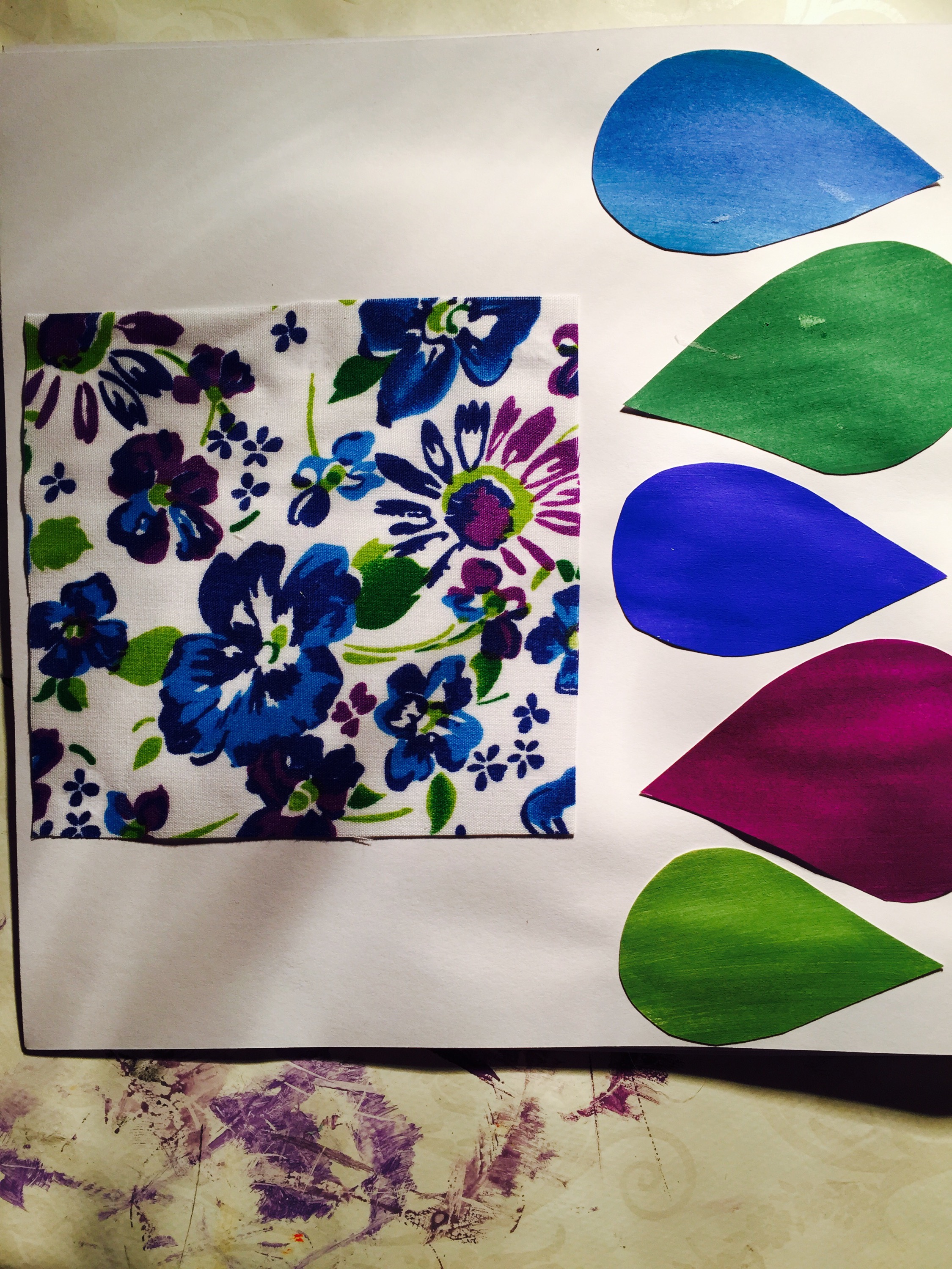
Aesthetics of  yarn

Aesthetics definition by http://dictionary.reference.com/browse/aesthetics

the branch of philosophy dealing with such notions as the beautiful, the ugly,the sublime, the comic, etc., as applicable to the fine arts, with a view to establishing the meaning and validity of critical judgements concerning works of art, and the principles underlying or justifying such judgements.”

The origin of the word aesthetic comes form the late 18th Century the word is derived from the Greek word aistheta which means perceivable things. It relates to the perception of senses. For example ‘the artwork was very aesthetically pleasing’ (pleasing on the senses/eyes).

When dealing with industrial yarns the aesthetics is not necessarily always that important because the yarns are used in a more practical way as oppose to be decorative or aesthetically pleasing. For example a belt for a piece of machinery does not have to be nice looking or be beautiful it needs to meet the requirements and be practical and durable. However on the other hand something like a hose pip is considered an industrial or technical use of yarn so does to a certain extent have some aesthetic pleasing qualities. For example the fact that it is usually yellow or green and has a certain smooth surface.

Handle and performance of yarn

Again, it could be argued that the performance of an industrial yarn is more important than that of a yarn used for non industrial purposes however I believe it is about getting the right balance between aesthetics and performance to create the perfect product. For example a hose pipe, although it needs to be aesthetically pleasing it would seem the functionality of the product is actually more important than how it looks whereas an item of clothing needs to look good but also be functional for it purpose. Again, the right balance is key.

On another note it could also be argued that performance of an industrial yarn or fibre may have more negative consequences if it doesn’t work properly so maybe performance is more important. For example if a conveyor belt snaps on a piece of machinery due an error with the yarn made belt it could result in injury whereas if a shirt splits because it isn’t strong enough it doesn’t really matter in the grand scheme of things.

Also the type of customer that the product is being sold to may have higher priorities in one area than another. For example someone who is ‘materialistic’ and likes beautiful things may buy a product that is more beautiful than functional whereas a ‘practical’ person may buy a product based on it quality and functionality.

What is important with the performance of a yarn? All of the below are of course dependant on the product that is being made with the yarn.

  • Movement- This links in with flexibility and ability to drape and hang if required. How a product moves will have a direct effect on what it can be used for. Does the outcome need to be flexible or pliable or rigid and firm?
  • Construction- The construction of a yarn will effect many of its features and how it is able to be used. For example if a yarn is coasted with plastic of rubber it will be less rigid than that of a yarn just lightly sprayed with a waterproofing substance.
  • Resilience- This refers how the product may ‘bounce back’ after it has been used. For example if a rubber conveyor belt stretches when it is hot will it shrink back once it cools and vice versa.
Posted in Uncategorized | Leave a comment

Part 4- Yarn and linear exploration.

Initial thoughts-

When first reading through the introduction blurb I found it very hard to process the information. For some reason the information presented to me just wasn’t clear in my mind. Even some clarification from my tutor couldn’t help me out with this one.

At this point I decided to take a little time out to try and clear my head and come back with a fresh mind a new perspective and sure enough 4 weeks down the line and I have read through the information again and it seems to make clear sense to me. I now know where I should start and how to begin part 4.

My reason for adding this small part of information into my blog is for future reference and just to note down my own curiosity for the situation that occurred. I know feel confident starting part 4 that I understand what I am to be researching.

Reading through the blurb one final time before I begin I can now begin to get excited about what the part may bring and how much I can learn here. Building other qualities from simple yarns and linear qualities just seems astonishing. I have completed crochet and knitting etc before but it never occurred to me to look at it in this way or from this perspective.

Posted in Uncategorized | 1 Comment

Part three-Written analysis

I feel that overall I have learnt a lot over part three, not just about colour and their proportions but also other things that I have researched along the way which have been really interesting. Part three has kept me engaged all the way through and everyday I have off work I have been wanting to get back to it to continue with the exercises.

I have never really studied colour in any way before, obviously I have used colour but I haven’t really ever made considerations as to why I am using that colour or what colours work well together, I have just gone with my gut rather than being analytical. I have learnt not only about different types of colour but also now understand the difference between tones, hues, shades and tints. This has been a bit of an eye opener because these are very simple things to know and it shocks me that I was able to achieve such a high quality A-Level with such a lack of knowledge of basic colour.

I have learnt about the types of paint and how they may work better with some tasks than other for example when completing the glass composition exercise I would say that it would have been much harder to achieve a subtle look with gouache paints. It is basic knowledge such as this which will help be the foundation for moving forward with this course.

My main strengths during these exercises I would say has been my collaging and presentation. Through the exercise I think the ones I thrived in were collaging and assignment three itself and this is probably because it is something I am used to doing and have enjoyed doing for many years.

My weaknesses have actually been mixing colour itself, I have struggled a little with this and this is probably because I simple don’t have much experience of mixing and trying to match precise colours. I have tried to make this a little easier for myself by completing research that helps me to understand colours and watched some online videos on how to mix colours. This helped me to have a starting point to work from and I then tried to improve from there.

Reflection by assessment criteria

Posted in Uncategorized | Leave a comment

Assignment three

When I first read assignment 3 my first thoughts were excitement not only because it was a new challenge but because mounting and presenting my work on boards and in sketch books was one of the many things I truly enjoyed while completing my A-Levels. However this style of mounting and presenting is something that I am not used to at all. My mounting style during A-level was completely different with not a clean cut edge or white background in sight. I found it hard to adjust at first and had to put a lot of thought and consideration into how I would change my mounting style to suite the simple and contemporary type required by this assignment.

For the front and back cover I wanted to do something that was relatively simple but still effective. For this I was inspired by an artist called Iris Hall.

Inspiration- Iris Hall

Her work displays colour in a very simple way that appears to be complicated to the eye because of how the colours overlap.

I simply got 2 pieces of white paper and began to splatter water colour paints in a random way with no thought required at all. I didn’t want that was organised and precise because I wanted to retain the style of a little rough edges and so on. I am hoping that I can achieve this throughout this book.

Although Iris uses acrylic paint in many of her works I decided to use water colour instead for colours that would be a little more subtle.

Reference to: http://fineartamerica.com/featured/splatter-two-iris-hall.html 

I feel pleased with the outcome of the front cover because it works exactly as I was expecting, simple but effective and striking. I am also happy with the choice of my font for the text. It has a traditional style but it still clear.

Gouache studies-

I decided to go straight in with a subtle colour combination rather then a more striking one to ease the person looking at it not to be too shocked straight away. This piece was hard to represent by colour alone because it has a clear woven texture. I feel happy with the composition as the colours stand out. However I feel that their is slightly more blank white space that I wanted but overall I am happy. If I were to redo this page I may consider having larger colour samples.

Page 2- the composition of this page is a little more adventurous than the first but works  effectively , this page is almost an opposite from the first as I feel it doesn’t have quite enough white space, although it isn’t really bad I feel the colours are quite close together so it can be a little confusing on the eye.

Page 3-

Again, the layout of this page is very simple, I like shapes of the colour cards as they are something a little different, I feel the white background in comparison to the page is evenly distributed and works well as a whole. It is the shame that the dark green card cost damaged a little as it is quite visible when just looking over the page.

Page 4- Gouache studies- representing texture.

I have already evaluated the piece as a while before when completing the exercise but looking back on it the actual painting part of this image is on a larger scale than the stitch pieces are, this is just purely a mistake as they should be in proportion with each other.  There is very minimal amounts of plain white on this page because I chose to mount using the pale cream background of the painting so I didn’t lose too much of my work. I also Feel happy with the shapes of the colour samples, I edited them a little from the original so that they worked well with the page as a whole. 

Page 5- exercise 3.2- translation through yarn

This page has the appearance of  having a divide down the left side. The Vermeer image and the  yarn experimentation fill one half of the page leaving no white space so it creates a clear divide. The 2 ribbons in the middle break up the page from being too rigid as they are aren’t set straight, they are just random and free. The  cards of the right hand side then reflect the rigidness of the opposite side as a whole I think the page is well balanced.

Page 6- Colour cards and yarns from 3.2

The colour palettes on the left hand side of the page create another clear divide like the previous page but is slightly different because the colours samples have rigid and rough edges, this helps to maintain the type of presentation I am trying to achieve. I am really like the layout of the right hand side of this page because there is enough white space to help the colours stand out but they aren’t too far apart so that the page looks empty. I think the connection between each page is clear and the colours represent the yarn experimentation very well.

Page 7&8 – Water colour studies.

With these upcoming pages I wanted to keep the layout and presentation very similar page to page to keep the focus on the work itself as oppose to the presentation. I decided upon a basic layout and applied to all pages with water colour studies. The right hand side page is just simple with the work having straight but rough edges with a slim border around the edge just to make the work stand out a little more. The page on the left is a little more complex, I wanted to display all of my connecting colour samples together but in a way that wasn’t just simple putting them next to each other horizontally or vertically. I decided to mix the two to create something a little more interesting. I think the overall outcome is something that is interesting to look at but doesn’t detract from the work itself. As mentioned I repeated this 3 times with only small tweaks to maintain some continuity from page to page that was displaying the same exercise.


Collage studies-

I really loved the simple look with just a border around the edge from the previous pages so I continued this theme when presenting my collage pieces, if anything I would say it is even more effective at making the work stand out with the collages because the bright colours are a contrast to the flat white background. I added a small title to this page just to help make the transition from one page to another clear. The right hand page of the below is a little different to the other pages I have presented but it was what felt right when laying out the page to experiment, after moving the items around the page many times this is the only layout that made sense in my head and was a little interesting. I tried to keep overlapping to a minimum throughout this book to keep things simple but here I think it works well. The white background around the image means it remains separate from the paper cuttings and helps it to stand out more. Without this I think the page wouldn’t work and it may look like all of the colours merge into one.


Continued colour studies-

I feel particularly proud of this collage just because of the amount of time and patience it took, this this reason I kept the layout very simple and as minimalistic as possible to let the work speak for itself. I used a simple border on the left page and just simple squares if colour for the right. I decided to centralise the image just to pull everything together and make sure the page was even and coherent. I think the layout of the right page is effective because each of the colours are evenly spaced and there is the same proportion of each one so no one colour stands out, they are all even and I think this helps pull your eye to the collage itself.
  

Final pages of collage work

This piece was my final collage so it was the last piece I mounted on the white boards, I decided to keep the same layout and them as my other collage pages and just keep it simple. Instead of using colour samples I used scraps of the text I used all ripped carefully to the same size. Again, I chose to centralise the images to keep everything balanced and even.
  

Other items I considered when making this colour book-

  • Using only very minimalistic text and titles, I chose to do this to let the work speak for itself and to let the person looking at the book interpret each piece in their own way. For me artwork and colours are a personal thing and each person will perceive a colour differently to the next. I also decided not to name my colours because everytime I look at a colour in a different mind set or mood I feel differently towards it. For example if I am feeling a little upset or down I might call a red- a devils pit, but if I am feeling happy and good I may call is a field of poppy’s. There is no definite colour names in my head so in my opinion it wouldn’t be right to put them down onto to paper and they wouldn’t always feel right.
  • Using 3D mounting strips- I decided to use 3D foam strips to mount my works ratehr than glue of double sided sticky tape, this is because I like the effect that it produces. It creates a shadow under each shape which I think enhances it more. Also using glue can be messy and sticky as well as a little risky with spillages and so on so I like to use something a little safer and more reliable. It also creates a clean finish whereas using glue can sometimes leave streaks, marks or distort a paper where it has seeped through and become wet. If I were to make this book again, I wouldn’t chain my mounting product I would use foam sticky pads again because I adore the effect it produces.
  • Colour Book size- I chose A4 just simple because it made sense in my mind, a lot of my works are A4 or smaller so I thought that if I used larger mounting boards it would be hard for me to fill the space, I understand that white space helps to draw the eye to the colours themselves but I think I would have struggled to make it look coherent and professional. I find bigger spaces harder to work with.
  • I chose to use a simple method of binding by using a while punch and some white tape. This type of binding added a little interest to the book but keeping the tape white helps to make the front cover stand out and not be overlooked by some garish ribbon. When I started this Assignment I had selected some pieces I wanted to mount in the selection process but was unsure if I would choose more or less, with this method os binding you can add and removed pages as you wish to help keep the book neat and tidy. This also means if you decide not to display a piece of work after more consideration that you can just remove the page instead of having to try and aimlessly fill the space with something else.

Overall I feel the outcome of this book represents me as an artist well, it reflects the type of presentation and mounting that I have developed over the last few years but is also clean and simple to still maintain the clean lines and contemporary look that helps to display the colours in the best way.

Posted in Uncategorized | 1 Comment

Exercise 3.4 collage studies 

My messy cupboard- For this exercise it was very tempting to set up an area to photograph but I then cam across this very messy area of of my wardrobes. I chose this photo both because of the colours and the layout. The colours are evenly spread- there is colour in mos areas of the image rather than just in one corner for example. I decided to print this photograph to work from and now looking back on it I can see that the quality of print means that some of the darker areas of the photo are missed out in my works.


Part One- A simple colour combination. My first instinct here was a simple striped design that would represent the photo in fewer colours in an unrecognisable design. This stripe design is very different from the original photograph. I painted some colours onto paper with gouache paints and cut them into thin strips to then use to collage. The colours I selected were determined by me staring at the photo for a few seconds and just picking those that stood out the most. This means they aren’t necessarily the most prominent in the photo but they are the colours that jumped out at me.

I found it hard to keep it simple because everytime I looked back at the photo another interesting colour caught my eye, I then decided just to stick with the colours I had painted along with a few magazine cuttings and not add anything else extra. I feel quite happy with the outcome, in comparison this collage looks extremely different from the original photograpgh. I think this is because of many reasons-

  • The simplicity- the simple striped design means the composition of the photo is left behind when I started to collage, the colour combinations are bright and bold and have a great impact when together
  • The amount of each colour, the stripes are unrepresentative of the amounts of each colour in the photograph, this makes it harder to make connections between the two
  • The size of the collage- I usually start with A4 but this collage I just didn’t feel it would work so I made a decision to go for a different shape. This shape is not the same as the shape of the photograph, it is more elongated so again this makes it harder to make a connection between each piece.

Although happy with the simplicity of the outcome I feel a little disheartened at the black strips that have not dried completed flat, this is because the magazine strips are very thin so didn’t dry with the same affect as the painted paper. Having reflected on this if I were to create a similar collage again I would just use one type of paper to collage with instead of using a mixture. This should then create a more coherent and high quality outcome.

Collage 2- Unusual colour combination

I first decided to look up the word unusual to see if the definition I had in my head was on the right lines. I would assume unusual to mean something that is not done very commonly or will surprise those that see it as it is unexpected. I then compared this with an official dictionary definition to get a clear understanding of what I am aiming to acheive with this collage.

Definition- Unusual-

  • out of the ordinary; uncommon; extraordinary: an unusual design.
  • not usual or ordinary; uncommon.
  • Connected to the word ‘ strange’ – unusual – strange is to say something is unfamiliar or unexpected

Reference to: http://www.thefreedictionary.com/unusual

When I read the word unusual I instantly thought of using papers that were not necessarily the exact colours in the photograph as this seemed something uncommon to do. I understand that the point here is to represent the photograph using as closer colours as possible but for an unusual colour combination I wanted to try and just use the colours I could find in magazines alone to match the colours as best I could within a limited media.

To start I just went through 4 or 5 magazines and ripped out any colours that I felt represented the colours in the photo. For the composition I decided to still keep it simple but represent the photo is a better way than the first collage. I feel I succeeded at this because it is a lot easier to see my thought processes and how I got from the photograph to the collage.

The colours are still very simplified in comparison but I think the combinations work well and although the colours don’t necessarily match exactly they do represent those from the photograph.

Overall I feel very happy with the outcome of this collage because it shows a clear progression from one collage to the next and from the photograph to this collage. I think , the colours combination is unusual because each colour is not completed flat, it has other shades and tones within it. This is because they were torn from magazines and it is hard to find just flat colour there. I think this is what makes it an unusual colour combination because it is not something you would necessarily commonly see.

Collage 3- complex colour combination

My definition of complex would be something that is very complicated and has lots of items or pieces within it. If something is complex it is difficult to understand of comprehend and maybe be confusing to some.

Definition – complex –

  • consisting of interconnected or interwoven parts, complex equipment with multiple components
  • difficult to understand for being intricate or involved.

Reference to: http://www.thefreedictionary.com/complex

After comparing definitions I can see that my thinking of complex was quite limited to my life experiences, for example to me I associated the word complex with a complicated and confusing mathematics problem. This meant the definition I had in my mind was to make a collage that was confusing when in actual fact this isn’t what I wanted to do at all. I realised that complex doesn’t just mean confusing it has a much wider definition.

One word that stood out to me from the above definition was ‘intricate’. I like this word because it has a sense of delicacy rather than a harsher sense of confusion that I associated the word complex with. I took the word intricate on board and decided to create a collage that is similar to a mosaic in the sense that I used small painted cards to create a collage that represented the photo.

I decided to use painted cards instead of found papers so I could represent the colours in the photo as closely as possible, this is hard to achieve because painted cards are one flat colours and the photo is mainly made up of clothing items which are woven or printed so have many colours not just one flat colour. However I feel using small cards to create the collage helps to add depth to piece and makes is more interested and complex. Using the small cards was very labour intensive and look me around 6 hours to complete in total. I would consider this piece to be both complex and intricate. It is complex because of all the small components and the hand painted colours cards and intricate because of the small details and  time taken to make this piece.

Overall I feel delighted with the outcome of this piece, the only I would possibly change if I where to complete something similar in the future would be making the cards used to create the collage even smaller and therefore even more complex. I would also like to complete something like this on a larger scale to create a really outstanding piece. This would probably take 10 hours and upwards to complete so possibly something for a final piece or collection.

Part 2

For part 2 I looked back through my previous 3 collages and decided upon the second collage I created to work from. This is because I felt the first collage is very simply and almost ‘too easy’ to make other collages from. I think the outcome would have been amateurish and so simple to be boring. I also felt the complexity of collage 3 stopped me from selecting this piece because to represent this well in other collages would take many many hours which is something that would be effective but I had to ask myself if the outcomes would be worth all of the work and effort. By this I mean collage 3 stands well as its own piece if I took this piece further I feared it would just look like reproductions of the first piece and I would find it hard to think of new ideas and take my thoughts further.

For these reasons I selected collage 2 to move forward with, this collage represents the photograph well but not completely and has good use of colour but again is not too complex and will allow me to experiment more when taking this further.

IMG_1061-0

Monochromatic study- Black and white

Definition- “Monochromatic colors are all the colors (tints, tones, and shades) of a single hue. Monochromatic color schemes are derived from a single base hue and extended using its shades, tones and tints. Tints are achieved by adding white and shades and tones are achieved by adding a darker color, gray or black”

Reference- https://en.wikipedia.org/wiki/Monochromatic_color

In my mind I considered monochromatic colours to be black, white and grey. however after completing a little research I now understand that monochromatic doesn’t just apply to black and white but to other hues too. I have researched this point before in a previous search point but for some reason my brain still doesn’t seem to have understood the concept. However after looking up a quick definition I decided to move to deciding on how I would create an interesting collage with just black and white.

When I first read this blurb of black and white collage I felt that it would be very limiting because black and white are just two shades so ‘how can I represent’ such a complex photo with two shades. I thought I would change this collage from the previous one and go back to using found papers so I decided to look through   a few magazines for come inspiration and then using words and text was an instant idea. When this was briefly mentioned in the description of this collage in my OCA folder I didn’t really consider it and thought I may be able to come up with something better myself. However after looking through the magazines I worked out that I could actually have effectively 4 shades to use instead of 2 by using text. They are:

  • Black
  • White
  • White text on a black background
  • Black text on a white background

This then meant I could represent the darkest areas and lightest areas with the basic black and white and meet in the middle by using the text with various background to present the colours in between light and dark.

I feel very happy with the outcome of this piece because I feel it represents collage 2 well and despite my first reactions to using black and white I feel it is very effective. The only negative of this piece is the uneven surface created by using very thin papers on a thicker background. This has created some bubbles in the surface and using PVA glue has left a slight sheen on the finish which I cannot quite work out if I like or not. If I were to make this collage again I would consider using book pages rather than magazine pages to reduce the sheen on the finish.

Collage 4- Single colour study.

I selected blue for my single colour collage not only because it is one of my favourite colours but also because of I piece I remember of Pablo Picasso painted by Tracy Harrington Simpson. I was introduced to this piece during my time in sixth form by a tutor and I loved the use of colours so I used this as my inspiration for my collage.

Reference to: http://fineartamerica.com/featured/pablo-picasso-the-blue-period-tracey-harrington-simpson.html

I began this collage by painting varied shades of blue onto plain white cards. Once theey were dry I then used a ruler to tare the edges so they were still rough but neat at the same time. I very much like how collage is something that is a little rough around the edges so although I used Tracy Harrington’s work for inspiration I still wanted to keep the rough edge look that I adore so much. I also wanted to keep all pieces vertical as I liked the effect of this in collage 1, this would give me the opportunity to experiment further with just vertical strips.

I decided to keep the shades I used very simple and just started with 5. I painted the darkest of the shade of paint I selected and then the lightest and worked with 3 shades in the middle to create a good but simple range of shades to work with.

The outcome is simple but effective. There is a clear connection between collage 2 and this collage and the single colour makes it interesting to look at in a different way. If I were to complete this collage again I would keep the scale the same but work this smaller strips. I would still keep the rough edges but just on a smaller scale.

Collage 6- Multicoloured Study

In order to decide on what I might like to do for my final collage I looked through my previous 5 collages and selected the 2 I liked and then decided to combine the 2 techniques to create a new and experimental design. Before starting my design I decided to do some research to get some more inspiration.

Collage Portrait by Nina Valkhof:

One of collages I selected to work from for this final collage was my monochromatic study using text. With just a few clicks on the internet I had found some work by Nina Valkhof, this below piece if a self portrait just using text. With just this little bit of inspiration I was then able to in-visage what I would like to create for my final collage.

Reference to: https://www.pinterest.com/pin/218565388142501571/

I decided to use text as the base point of the collage and the colours of collage 2 to create something a little more interesting. Finding of the background colours with the text that I needed was a very labour intensive process but it was worth the looking because I am very pleased with the outcome. The collage has still remained as simple as I had hoped but has added complexity from the text. It creates an interesting piece to look at because as you look over the piece certain words are eye catching and this adds an extra depth to the overall finish.

Review Point- Quality of outcome

At this point in part Three I am feeling happy with the quality of my outcome so far> I feel I am beginning to get into the course and create my own style and personal approach to eat task. I am now beginning to realise that this assessment criteria is not just about how my work is physically displayed or presented but how I am creating my own voice and creating works that flows from one piece to the next. In these last exercises it is clear for me to see how I have developed and I am now very much looking forward to presenting it in a way that is personal to me.

Posted in Working towards assignment 3 | 1 Comment

Exercise 3.3 water colour studies 

First Thoughts:

When reading through this exercise I was excited, it seemed fairly simple and the outcomes looked interesting in the folder so I was eager to get started. Before starting the exercise I decided to get my old water colours out and just use a medium brush to test some of the colours and get to grips with using then again. Here is the outcome:


By doing this I think I helped to free my hand up a little and got used to how to lighten the colours so they are subtle and got an idea of what brush size I might like to use while completing the paintings. I used some youtube videos to help with the basic watercolour techniques as a starting point. I just used my brush freely and feel happy with the outcome because it helped me to ensure i completed the exercise to the best of standards.

Reference to: https://www.youtube.com/watch?v=tB4V5vlvzTo

Finding my items- I didn’t look too far for any of my glass items I just looked around my own home and found a few items that looked interesting. I began setting up my scenes with some white card as a background and base for the glass. This gave a clean fresh look and ensured none of the colours or reflections from the glass were distorted.

I decided to go ahead with a small brush as I thought it would allow me to add the most details because I could fit more lines onto each page. I also decided to use an A4 page as a starting point so that i wouldn’t be limited by paper size. I tried to make my composition of glass about the same width as the a paper so it was easier for me to make the marks accurately and within proportion.

Watercolour mark making-

Although the below image is first on this blog, this was actually the last watercolour mark painting that I made, the addition of chequered glass on the right hand side was an interesting addition that I found while making a drink during the exercise, I decided to swap out the wine glass so I could experiment a little more. Another thing I found interesting about this composition was how it effectively has 3 columns of glass at the front and then the horizontal bottle at the back, this makes it very even and balanced on both sides.

I think this is evident in the water colours marks because you can clearly see the 3 columns and then the shocking red stripe from the bottle lid. After adding the chequered glass I realised just how hard it was to represent accurately, because the striped on the glass are evenly distributed when using water colours paints and a small brush it was hard for me to keep my hand steady enough to keep the lines even width and length as well as even spaced apart. Although I feel the outcome represents the composition well if I were completing a task for final presentation I would consider finding another method so I could make it more accurate.

Another thing I particularly like about these water colour marks is the subtleness of the colours, I think after one or two of the other water colours paintings that I did first I found a good medium between being able to see the colours and then not being too bright and unrepresentative of the glass composition. Although these colours may be a little brighter than what my eye can see I think they represent the piece well and it is clear which line is which and what represents each piece.


The composition of the below glassware was a little more challenging to represent because of the stem of the wine glass and the many overlapping reflections and edges to the right side of the composition. The lines of these water colour marks are quite vibrant in comparison to the glassware itself, I took the colour that I saw and out it to paper, with this one I didn’t worry too much about diluting the colours, I just wanted to get them to paper. However now looking back I think they are a little brighter than I had first intended. There is still a clear connection between the composition and the mark making but I don’t feel it is the very best representation.

On the other hand the brighter colours do look more interesting and although they are brighter it makes the mark making look more abstract. I realise now that this was not necessarily the objective of this exercise but I think you can see clear improvement from one mark making to the next.

This below composition was really fun to try and represent because there is actually some brighter colours, I added in one my kitchen jars from home that is a vibrant blue so this added a new depth of water colours for me to explore. I started with the many shades of blue and then added the browns and greens of the other glass. Again, I didn’t dilute the paints too much as they just saturate the paper and it makes it harder to put stripes next to each other as they just smudge into one. This was not something I was aiming for.

Overall I feel very happy with this particular mark making because I think it represents the composition well and even though some of the colours are quite vibrant it works well and helps to highlight the bold blue even more.


For this composition I tried to keep it very simple and just put of my glass vertically. This then created 5 columns of glass. Again, the blue jar was run to represent the the red stopper on the bottle is also a prominent items within this mark making. Looking back at the photo the other glass looks to be more green than brown which is strange because obviously at the time of completing this exercise my eyes saw it a little differently. This also shows just how different a photograph can be from what your eyes see in real life.


Research Point- Why doesn’t my camera capture what I see by eye?

I found this an interesting point to consider because my photos don’t represent what I saw with my eyes. This can be due to many things including, angles, natural light changing, artificial light addition (flash) and mega pixels and quality of image.

The camera that I am using to take my photos has a high quality 8 mega pixel camera, However someone with 20/20 vision is capable of resolving the equivalent of a 52 mega pixel camera. Obviously not everyone has 20/20 vision (including myself as I wear glasses) but there are also other variables too such as this 52 mega pixel can only be achieved at a 60 degree angle. So although there are variables on both sides that effect what an eye captures and what a camera captures there is no denying that a camera (even a professional 20 mega pixel camera) is falling behind the humans eyes 50 or more mega pixels.

Another thing that effects the quality of images that is seen by the eye after being captured by a camera is the screen that you look at it on. I have already seen in a previous research task that colours look different dependant on the screen they are viewed on. For example the image I see on my laptop appears to have different colours to that of the image I see on my phone and this is because my phone has a better higher quality and newer display.

Reference to: http://www.cambridgeincolour.com/tutorials/cameras-vs-human-eye.htm

This final water colour piece is a simple one, unfortunately I have not taken a photo of the glass composition that I worked from- I must have completely forgotten too and just moved on. From the mark making I can see that the left hand side had the chequered glass, the right hand size had the blue jar with grey closing mechanism and the centre had the tall bottle with the red stopper and grey closing mechanism.

The fact that I can see and identify which items would have been in the composition and what kind of angle they may have been at shows me that the stripes represent the image well and that there is a clear connection between the two.

I can also see just from looking at the mark making that my paper was a little too wet, the watercolour has began to smudge and texture the of the paper has started to lift and disintegrate. This is something for me to bare in mind in future water colour studies. For this exercise simple water colour paper was sufficient but I would definitely need to buy better quality paper if I were intending to create a final piece or picture painting.

Posted in Uncategorized | 2 Comments

Exercise 3.2 translation through yarn 

First a little research- Old Masters Painting

From looking at various definitions of ‘Old Masters Paintings’ the explanation is complex and not all that gathered, the definitions vary and there seems to be no one correct answer of who is a master painter and what level of artist they have to be before they can gain this title. In the terms of fine art the term ‘old master; traditionally refers to the greatest of European painters that practised between the 1300s and 1800s.

The list of painters that gained this Old Master status is long but there is no true way of defining how they gained this status or what level of education to skill you have to have in order to obtain this highly ranked status. Maybe it is just down to pure experience, there is no true way to tell. The list of artists I have come accross includesm Giotto, Leonardo, Jan Van Eyck, Michelangelo, Tintoretto, El Greco, Goya and Vermeer.

All of the well-known artists from the above list all fall into the same category due to the period they were painting in, although there is no clear definition the term ‘Old Master’ is used to categorise these artists and many other like them to brand and separate the greatest European artists from the given period from those famous painters of the modern era.

Reference to: http://www.visual-arts-cork.com/old-masters.htm

After researching some of the above artists very briefly I can see each artist has their own style and individuality however there is still a sense of continuity and collection between the artists. There is a clear distinction between the artists and the era they were painting in, they all appear to have similarities, whether it be colour, decoration, skills, media used- there is a connection from painting to painting. After briefly researching over 10 artists I decided to go with my gut and just pick the two I felt pulled towards or found the most interesting. My choices Vermeer and Tintoretto, I chose these because they seemed to contrast for me, I didn’t want to pick two artists that had a similar feel or ambiance to them.

Tintoretto

tintoretto 2 tintoretto108

Tintoretto was born Jacopo Comin but gained this name ‘Tintoretto’ because of his family, he was born in late September or early October of 1518 and was known for his Phenomenal energy in painting, because of this he gained the name Il Furioso. He also gained the nick name ‘Little dyer’ because of this father occupational as a tintore (dyer)- over time this then altered and he became known as Tintoretto.

Tintoretto was working as an independent, well established professional artist by 1539 and he remained in Venice through out his career meaning he became one of the most famous painters in the 16th century. He worked mainly in oil paints and received many commissions for church altarpieces, large scale paintings for civic buildings and portraits of Venetian nobleman and statesmen. Tintoretto was known for his use of loose brushwork and rich glowing colours in his paintings, he was also known for the theatricality of his paintings because the figures were shown in motion with muscular tones. He prepared for painting by making small model stages which he filled with small figures in order to plot the arrangements and observe items such as shadow and light.

Tintoretto died in Venice on May 31st, 1594, he had many children with his wife and some of his 8 children who had trained with their father still continued to carry on his legacy. His son Domenico Tintoretto was the most famous and remembered of this children, he painted many exquisite paintings but they were always considered mediocre compared to the works of Tintoretto himself.

Reference to: http://www.biography.com/people/tintoretto-21366707#later-career

Vermeer


Johannes Vermeer is one of the great Dutch masters, considering this only around 35 paintings by him are actually known by others. He was born in Delft in 1632 and it is thought he may have been a pupil of local history painter Leonaert Bramer. The image below is a self portrait by Vermeer himself. It is very representative of both his style of works and the colours that reoccur in many of his works.

Vermeers earliest works in the 1650 include many religious and mythological subjects as well as other scenes. It is thought that they are influenced by Caravaggio’s followers in Utrecht such as Hendrik ter Brugghen.

Vermeer was Catholic and married in 1653, the year he became a master in the Delft painters’ guild. Although the name Vermeer is relatively well Known he produced very few paintings although it is thought he spend extended periods of time on each piece. He died in 1675 insolvent leaving his wife and many children. Although Vermeer’s work inspired even international collectors to visit his studio he still couldn’t stay out of financial trouble.

Vermeer’s paintings often focused on everyday life scenes from areas in and around the city of Delft. His subject of most of his paintings were that of ordinary people and domestic life in the 17th century. He was popular for his realistic paintings and he is sometimes therefore described at’ the painter of the people for the people’.

Although Vermeer held nothing original in his artistic interpretation and subject matter, he was extremely skilled in creating superb pieces of art. He didn’t create many self portraits, focusing instead on objects that took the viewer to an image as he saw it. Vermeer does not create a specific narrative in his works like his contemporaries did but instead focuses on the moment itself and the rest of the story is created by the viewer.


Posted in Working towards assignment 3 | Leave a comment

Part Three-Research point 2

I have chosen to firstly look at Adobe Colour CC- downloaded it both onto my phone and computer so I could see the comparisons between screens.

Before I even started to look at colour the option beside the wheel was asking for me to select a category- I didn’t understand the categories so did a little research.

Monochromatic– These are all the colours of a single hue, Monochromatic colour schemes are derived from a single base hue and extended using its shades, tones and tints.

Triad- A triadic colour scheme uses colours that are evenly spaced around the colour wheel. Triadic colour harmonies tend to be quite vibrant, even if you use pale or unsaturated versions of your hues. To use a triadic harmony successfully, the colours should be carefully balanced – let one colour dominate and use the two others for accent.

Complementary – Colours that are opposite each other on the colour wheel are considered to be complementary colours (example: red and green). The high contrast of complementary colours creates a vibrant look especially when used at full saturation. This colour scheme must be managed well so it is not jarring. Complementary colours are tricky to use in large doses, but work well when you want something to stand out.

Reference to: http://www.tigercolor.com/color-lab/color-theory/color-theory-intro.htm

The basics- A tint is the mixture of a colour with white, which increases lightness.

A shade is the mixture of a colour with black, which reduces lightness.

A tone is produced either by the mixture of a colour with grey, or by both tinting and shading.

Reference to: https://en.wikipedia.org/wiki/Tints_and_shades

Adobe color CC really is a wonderful tool, it is a quick and easy way to experiment with making new colours and seeing how colours can be changed into various shades and tones at just the click of a button. It is a much more efficient way to experiment with colour but it takes the art out of mixing colour. It was amazing tool to use but I found it just as hard mixing colours on the screen to match items I have in real life as mixing paint to create colours. Mixing paint by hand is certainly more time consuming but it is more interactive so I therefore found it worked better for me.

Mixing colour online has an unknown amount of possibilities, the colours that can be created in just seconds is incredible. Another thing I found useful is being able to find the shades and tints of one hue so easily, this allows you to see what the colour you have created would look like if it where darker or lighter.

Setting one colour and comparing between phone and computer screen- I used Adobe CC to choose one colour on both my laptop and phone. The colour I chose was a shade of purple. When looking at my phone the colour seemed to appear more vibrant whereas looking at my laptop screen the colour looked dull. This may be because my phone screen has much better picture and colour quality as it is newer. My laptop is more than 4 years old now whereas as my phone is just 2 months old so obviously the quality of display is a lot better.


I did this exercise just to get my head around how the adobe colour works and see how the colours I would pick out by eye the colours the app picks out. quite often I have found that the app would select colours of small proportions that I did not really notice.

Looking at just the palettes without the images they were drawn from I can clearly see the colours of the various rooms in my house. For example the many shades of cream, grey and cream are from my living room as that is my colours scheme and the turquoise and blue palettes are from my bedroom, the difference between the palettes is incredible- to me they represent so much more than just colours. It is interesting for me because I associate each of these colours with a part of my home and therefore part of my life. Just walking around my home now I have a different perspective and can see the colours that jump out the most and those that are more subtle that I previously paid no attention to.

Colour Hunter

I opened this online and tried to use it as best I could but I didn’t understand what to search for colour palettes and I also couldn’t save any. However, it was interesting to see which colours is picked from the images to create the palette as they are not always the most obvious or prominent within the image. Below are some of the colour palettes I discovered.

Capture 7 Captur 8 Capture

ColRD

This website is truly an inspiration, the colour palettes are wonderful, it is great to see an insight into others minds when choosing colours. I created a few palettes of my own-
Capture 1Capture 5Capture 4Capture 3Capture 2

Posted in Uncategorized | Leave a comment

Exercise 3.1- Gouache studies

Part 1- When reading through this first exercise my in instant thoughts were this is going to be hard but I didn’t realise just how hard it might be. For my fabric choices I used some that I had available to me from my collection and some scraps bought from my local fabric store. I found the printed fabric with 4-6 colours very easy to find however finding the neutral samples was very hard, I spent along time in the fabric shop struggling to find anything suitable as a lot of the interesting textures pieces only containing 1 colour. Eventually I decided to pick and embroidered design in cream, grey and black.

My first fabric samples was one bought fro the local fabric store, after looking at it, I know realise it actually has 7 colours including white. In the shop I counted only 6 colours as for some reason the white did not ‘count’ as a colour which I know see was the incorrect thought process. Regardless of this not wanting to waste fabric I started to mix colours. At first I found it very hard to even get close to the colour but after a while I started to realise what colours needed to mix to what in order to get the desired colour. Although I worked hard on getting the right consistency on order to create an opaque square of colour as is evident below, it didn’t work all that well. Looking back I believe I may have used to much water and as a result the paint samples are a little translucent. In the below image the colours on this embroidered fabric look completely different to those on my colour samples. the stitching looks almost gold when it is actually grey. The hardest part about trying to represent the colours in this piece is the sheen on the fabric. This means that it different light the colours look different. I think I may need to go back to these colour samples and rework them and add others to represent the fabric better.

The colours in the fabric below seemed to be easier to create than some others, I am unsure if this is because I had started to understand colour mixing a little more now or just because of the colours on the fabric being very simple and similar to my base colours. The colours on this fabric also include 2 shades what I consider to be the same colour. For example the 2 shades are purple are very similar except one is brighter and paler and the other is darker. Once I had created one I just added a little more blue to darken the purple and then a little white to flatten the colour. The below fabric also has a bright white background but I chose not to include this in my colours as a brilliant white is not a colour I am able to achieve my my paints. The white is actually more off-white.

In the below fabric the colours are very simple, in the picture I have taken the red and orange look almost the same colour but as you can see on the fabric sample they are not the same at all. The pink was the hardest to create from this sample just because it is such a subtle colour, I had assumed foolishly that mixing red and white would create the perfect colour however when I looked closer I could see it was more purple and so needed to add many other colours in order to get my final colour. The orange was also hard hear because in the fabric it is almost luminous however no matter what colour I made when they dry, they dry very ‘chalky’ and this took the brightness away from the colour. Eventually I realised adding a little more water to the mix stops the paint becoming to ‘flat’ and ‘chalky’ and helped me achieve the colour I was looking for, however this means by colour sample is not completely a solid colour.

The below textures piece of fabric not only made it hard to create the colours but also made it harder for me to actually see what the colours are as it almost plays tricks on your eyes. Because the colours are women together it creates and interesting texture and also an interesting use of colour. There are darker browns woven next to beiges and this creates an illusion of a lighter colour, I tried to create the colours of the yarns themselves and not just those that seem to be there. The beige was by far the hardest colours to make here, it took me at least 10 attempts to even get close to the colour , as when creating the light pink in the above samples I think  the colours most difficult to create are the subtle and neutral ones because there is so little between the colours. I find it hard to explain what I mean by this, With darker colours there seems to be a definite Yes that matches or no it does not. However with these lighter colours I thought it matched perfectly and then I would look again and it looked nothing like the colour- this is very confusing for me.

The proportion of colours for this fabric are very even, there doesn’t seem to be just one colour that stands out or there is more of than another. I think this is because there is no definite background colour. The design is the background and because it is stripe the colours are distributed evenly. It is interesting how when they is no definite background that it is then hard to out ratios on the other colours. If anything  I would say they are almost equal but with white having just a small percentage. 

As can be seen from the sketch book pages below the neutral colours where by far the hardest to create.
  
Part 2-

Painting out from the fabrics was hard because you not only have to use your imagination but also have to repeat the colours that your previously made before, I covered over my paints with cling-film which meant when I was ready to start part 2 I had some of the colours already. However the colours that I had thought where a perfect match, when I put them onto the paper next to the fabric I was alarmed at how different they were. I had to then tweak my colour samples before I could begin painting, Allowing for drying time also makes a big difference, when the below samples was still wet I was a little worried because the colours still seemed so different however when they had completely dried I felt quite happy with the result.

The proportions of colour in this sample is quite even, although the pink is the background colour the designs in blue and purple are large and therefore make the background less prominent. Here I would say that the pink is about 40% and the purple and blue shades about 10% each and then the turquoise and white have an even 7% each and then a small 4% for the brown.

The painting out from this fabric did not go as planned, this was the first piece I did and went straight ahead and got started without rechecking my colours which I can now see was a mistake, The colours don’t match up well at all and this is because I didn’t pay enough attention to the effect drying would have on the colours. Because of the poor outcome I decided to paint out from another fabric sample and try again. The above sample worked better and looks a lot better matched because I rechecked my colours. I kept the below piece for reference instead of just throwing it away.

The overall colours proportions of these fabric are quite even, although the white background colour is still very prominent because the pattern is so large and bold there is also a lot of each of the other colours. It cannot be seen so much in this small sample but overall I would say the background is about 30% of the colour and then each other colour is split equally as the fabric consists of the same colours just in different designs.


Part 3-

Painting out from the below piece was the hardest to complete of all the fabrics I think, matching the colours was very hard because of the sheen, it also has a coloured background so I wanted to complete this first and then paint the detail on top. I decided to sponge on my background colour for a more even finish. I struggled with this piece because of the textures too, I wasn’t able to just paint some lines on with the selected colour and that would be it. I decided to actually use the colours and paint brush skill to try and show the stitches in 2D form. The grey stitching was hard but instead of just using a base grey I used white and grey to create a textures look. Overall I feel happy with the outcome of this piece, it is far from perfect but the colours match well and what I was trying to achieve can be clearly seen.

The proportion of colours in this fabric is very uneven as the background colour is very dominant and Is around 90% of the whole fabric, they grey and black are just added in small quantities.


This exercise has definitely taught me a lot about colours and their uses as well as mixing colour. After mixing one or two colours I began to be able to imagine more clearly what would happen to a colour if I added another one to it, For example if the colour is very vivid and bright and needs to be duller and darker add grey. This worked well for me and I know understand how colours vary with drying and how just the slightest change can make such a difference to a colour.

Posted in Working towards assignment 3 | Leave a comment

Part three- Colour Studies

First thoughts- Starting to read through some of this part if course I feel very excited to be working with colour. Obviously I have worked with colour before but not in a way that I had to analyse the use or percentage of colours. A lot of colour I have used is more a quick decision rather than a thought out and planned process. I hope colour studies will help me to produce samples that are more coherent and work well together.

Research point 1-

Voyage Decoration- Reference to: http://www.voyagedecoration.com/arabesque-collection/gallery.php

Voyage Decoration are based in Cambuslang in Glasgow, Scotland. The collections are designed by a huge range of designers. As there is such a variety of designers it was extremely hard for me to find much information on the  company itself and its owners.


The works of Voyage are just beautiful, the colours compliment each other so well and fit together as a collection, the colours are bold and brave but used wisely as to not be overpowering. The design here seems to be more important than the colour, these pieces would still be just a beautiful in black and white and maybe even grey. The combination of intricate pattern and simple colours works exquisitely but it makes me think what would one be without the other.

Marrimekko- Reference to: https://www.marimekko.com/

Marrimekko is a company that is based in Helsinki, it has made huge contributions to the fashion industry and was very popular in the 1960’s. It is well known for its bright colours and large floral print patterns. Their designs are not used only for garments but for home furnishings too. The two main designers that have helped Marrimekko gain its reputation are Vuokko Nurmesniemi with bold stripes and Maija Isola with very large but simple floral prints. These designers created many many distinctive patterns and played a huge part in making Marimekko a popular household name.

Marimekko was first founded in 1951 by Viljo and Armi Ratia, it was after the former oild cloth factory had failed and was then converted into a garment plant. They then gathered together some artist and designer friends and asked them if they would apply their graphic designs to textiles. Once the fabrics had been designed and produced they needed to showcase them to the world and they this by creating a line of simple dresses with their fabrics.

Their main early recognition was when Finlands leading industrial designer Timo Saraneva invited the company to a fashion show in Milan. Although the show was actually cancelled the garments were eventually displayed in an up market department store which at the time was managed by Giorgio Armani.

Marimekko was first introduced into the US  by a famous architect named Benjamin C.Thompson, this meant they had heavy coverage in his design research stores. They then really became known in the US when Jacqueline Kennedy bought and wore eight Marimekko dresses throughtout the 1960 US presidential campaign.

Even if you don’t know or haven’t ever heard of Marimekko chances are you will recognise their designs, the large, loud prints will remind anyone of the very iconic 60’s ladies fashion. Although not every print in the 60’s was quite as loud as Marrimekko there is always elements of bold prints and bright colours.

By 1965 the company had really lifted off and employed over 400 people, at this point the company was not only in to ladies fashion but anything from fabrics to children toys, dinnerware and evenly completely equipped small houses.

In 1985, the company was sold to Amer-yhtyma and then in the early ninties Marimekko hit some troubles and was in a bad financial condition, it was even considered ready for bankruptcy. It was then considered to be saved by Kirsti Paakkanen who introduced new business methods into the company. A huge hit for Marimekko was it’s publicity in the hit series Sex and the City in the 1990’s. The series featured a Marrimekko bikini in season 2 and a dress also as well as a series of tablecloths later on.

More recently in 2005 Marimekko’s revenue has quadrupled since Paakkanen’s purchase, at this point Paakanen remained the CEO of the company and owned 20%. in 2007 she announced she would be gradually hand over her ownership to Mika Ihamuotila as CEO and the biggest owner of the company.

2007 was the start of the opening of individually owned Marimekko concept stored in the US and Canada.They currently have stores located in New York, Cambridge, Massachusetts, Oxford, Mississippi, Miami, Florida and Vancouver. In September 2011 they had 84 stores across the world.


The works here are just so simple, there is minimal use of colour in these relatively simple designs, as in the last design you can see there are just simply 3 colours on a white background. This makes the colours seem more apparent than the actual design itself. If I were to look at these alone without any other of the artist work I would say their signature way to use colour is big and bold. Using very block colours as oppose to many shades. It is clear to me how Marimekko has been so successful, the prints are so simple and can be used in so many different ways. When a designer creates something so bold it is easy for those prints to either be loved or hated. In this case clearly the public were taken by the designs and this then created publicity for Marimekko as well as a market to sell their designs.

This design my Marimekko is used in many various colours to create different fabrics. The use of three colours with just one background colour is very effective, it makes the deign bold and clear without being too plain. The most prominent colour here is the orange petals of the flowers, in some smaller designs the background colour is often the most prominent so this is a good contrast. The  white background is then the next most used colour with the yellow inner flower and blue stems coming last. The colour use works well the design but is not necessarily realistic colours- by no means am I saying that the colours need to be realistic it is just an observation. The colours are very bold and there is not any shading or different hues. This makes the design very cartoonistic and maybe this is why the design appears so bold. The colour is more important than the design in my opinion. If the design was in black and white the impact just wouldn’t be the same.

Wallace Sewell- Reference to: www.wallacesewell.com

A little history

Wallace Sewell is a British based design studio established in 1990 by Harriet Wallace Jones and Emma Sewell- The College of Art graduates. They are well known for their scarves as well as the moquette fabric designs for the London Underground transport seating. Their first exhibit took place in 1992 when their pieces and designs created much enthusiasm and interest. Barneys in New York even placed an order for scarves which then led to publicity and helped the business to take off. Barneys are still buying today and Wallace Sewell now supply over 200 stockists in 20 countries.

All of Wallace and Sewell’s designs are created in London and Dorset by hand and then woven by machine in a family run mill in Lancashire. They not only keep production in the UK but they strive to unite craft and manufacturing, embracing traditional techniques. The first part of the manufactring process begins on handlooms in London and Dorset Studios, the weaving of the fabrics then takes places in a family run mill, they combine traditional techniques and values with states of the art technology, this allows flexibility in order to weave small individual batches as a oppose to mass production.

Wallace and Sewell are known for their use of colour, structure and yarn in geometric formats. A lot of their contemporary fabrics are inspired by paintings, each piece has an individual contemporary feel.


The colour here appears to be more complex than it actually is because of the way they interlink and combine. When something is weaved the colours get forced together as they overlap this can create confusion on the eye of what colour is what and where the clear division is. For example if a yellow yarn is woven with a green yarn as they overlap it will create a different colour, it may not be perfect blue but it is confusing on they eye as to what the colour actually is. his can make the colours within the designs had to identify.

These designs do show control and have obviously been thought out but when looking at them you could assume they were random choices bought together by chance, it is hard to say from the above pieces if the designers have a signature way of using colour. I now the colours and designs are inspired by paintings but their is no indication as to what the painting might be, this therefore for means there is no comparison to make.

I have chosen to analyse this design- which is the design used for the seats in the London Underground. The distribution of colour is very unorganised and is a large scale repeat pattern. The main colour here when first looking at the design is dark brown. There is then orange, beige and small hints of blue. I find it easier to analyse colour compared to deign when there is a clear element to compare the colours to. For example a floral pattern- you can compare these to the actual colours of flowers in real life. However comparing colours in a design such as the above is a little harder. The colours in the above design work well in my opinion because the brown and beige compliment each other and the orange adds a pop of colour. It makes the design look interesting and not too plain. Considering the use of this fabric I would Imagine brown is the main colour to hide stains and make for practical use, the orange and beige have then be added to make sure the design is not plain and boring. Here the colour is much more important than the design, the colours are what makes the design. If they design was just black and white the design would seem random and would not work well because of the colours being next to each other. For example if you were to use black and white only the design would look different because there is not enough various colours to achieve the design. This is because too many white and black bits would be directly next to each other- merging them into one. 

This is interesting to think about because I would have said that the checked and woven designs that are typical of Wollace and Sewell the design is equally as important as the colour. The traditional designs by Wallace and Sewell feature wonderfully pastel and  brighter colours within their designs but the lines and designs themselves are just as important. The seating for the London Underground was obviously something a little different from their usual designs and this is maybe why my opinion is so different when comparing the 2 types of design. 

Vlisco – Reference to: www.vlisco.com/home/en/page/305/

Vlisco is based in and produces designs for the West and Centrak African market. Founded in Helmond in The Netherlands in 1846 the Vlisco Group and their fabrics have now grown hugely into an essential part of African culture. Vlisco is not just one company but 4; Vlisco, Woodin, Uniwax and GTP. Both design and production elements take place in Helmond and other facilities are based in Ghana and the Ivory Coast.

As mentioned the Vlisco group was founded in 1846 when Pieter Fentener van Vlissingen bought an already established printing factory and name is P. Fentener van Vlissinhen & Co.- his aim was to produce and well high quality hand printed fabrics both in and out of the Netherlands. Their original production lines included simple items such as bedspreads, handkerchiefs and furniture or upholstery fabrics. After  the 1950 Vlissingen started to explore imitation batiks, he did this because his uncle had explained to him that their was a desperate need to affordable fabrics. 

(Batik- Is a process by using wax on a whole fabric to stop the dye from spreading, the wax resists the dye and therefore creates a pattern.)

However, thank to the invention of roller printing it was possible to recreated the batik look a lot less labour intensively which meant that Vlissingen could produce it much quicker and sell it cheaper than any local tradesman would be able to. This actually was really his only selling point because Indonesians did not really care about the look or design on imitation batiks. The fact that Vlissingen’s fabrics cant to West Africa is a rather logical idea, once the Dutch East Indies had banned imitation prints it meant that he could no longer sell his prints as he was doing. He needed to find a new market to enter and sell his goods in. 

By the time the 20th century had come around both the West and Central African textiles markets were booming and therefore creating a bigger target market for Vlissingen. Furthermore by the 1930’s the ‘Wax Hollandais’ cloth’s designs were being adapted so there was something to meet the local tastes.

”WAX HOLLANDAIS

Vlisco Wax Hollandais is a special wax product with one or two core colours ‘fitted’ into the Wax Hollandais design. The designs are always mirrored on the front and back of the fabric (cotton cloth). The range and combination of colours used is extremely varied and emphasizes the unique styles of Vlisco fabrics. Patterns and prints that inherit the African culture. One of the colours is often used to highlight a natural bubbling effect, which contributes to a unique and lively appearance. This is the true sign of a quality Wax Hollandais block print.  The appealing pattern and unique colour combinations ensure that everyone can express their individual taste and personality in their clothing.  We use a unique collection of shades like yellow, blue, green, red, pink, purple, orange and brown. The fabrics are available in 6 yard, sometimes also in 2, 4 or 12 yards. Shop the colourful design world of VLISCO, for sale in our online store. Since 1846 we have been creating unique Real Dutch Wax fabrics in Holland that have influenced the African fashion landscape.” – Vlisco website (referenced above)

In 1927 the company changed it’s name to Vlisco, a shortened version of Vlissingen and Co but by this point ‘Dutch Wax’ or ‘Wax Hollandais’ and those names seem to have stayed with the company. During World War two the production was stopped and fabrics could not be shipped out to African markets this then meant that after the war when shipping could start again their was a huge demand for the products and this meant they were an immediate success. They were such a success that all Vlisco fabrics now have ‘guaranteed Dutch Wax Vlisco stamped to them because of the amount of imitations  and counterfeited products that were also on the market.

In the mid 1960s the import duties or taxes on printed textiles were doubled which meant that imported products were then moved and produced locally to get around these taxes. This is what primarily what led to the establishment of the Ghana Textiles Printing Company brand in the 1966, with all of its production taking place in Ghana.

Vlisco has developed a highly sophisticated and complicated production process which means that each piece of fabric is treated in 27 various ways by both hand and machine- the process can take up to two weeks in total. This process is not known by many is a closely guarded secret to stop counterfeited products.

This company and its various four brands has such a wonderfully rich history, it is just amazing to read and learn about the companies history- how it got to where it is from being established in 1846.


The colours in these designs are very bold colours – nothing too complex. There is a clear division and line between each colour and this creates very loud and outrageous work. Here I would most definitely say the colour is most important especially considering they are representing African style fabrics and works. The patterns are beautiful but without the bold colours they would appear to be nothing special. 

Paul Smith –

Reference to: https://www.paulsmith.co.uk/uk-en/shop/ & https://en.wikipedia.org/wiki/Paul_Smith_(fashion_designer)

Sir Paul Smith was born in 1946 and is a British designer with a focus on Men’s fashion and tailoring. His company was founded in 1970 when he opened his first ship in Nottingham. He now has over 300 shops worldwide with an annual turnover of more than £200m.

Paul Smith did not always have dreams to be a fashion designer, his real ambition was to become a professional racing cyclist. However unfortunately when he was 17 he was in a serious accident meaning his ambitions of being a racing cyclist ended. He spent over 6 months in hospital recovering from his accident and during this time he got introduced to and made friends with some people from the local art college who would then be the people to introduce him to the amazing world of fashion. 

His career started after his recovery from the accident when he began to take tailoring courses and then joined Lincroft Kilgour on Savile Row where his designs were worn by celebrities including George Best.

Along with his then girl friend and now wife who was a Royal College of Art graduate and their life savings he opened his first shop in Nottingham in 1970. His first showcased his mens wear collection in 1976 in Paris and since then has continued to move forward and expand his knowledge and career.

One of his goals was to change the perception of the suit, he did this in the 1980 along with Georgio Armani too. They were both trying change the image of the suit from formal and rigid to something a little softer and more informal. Something that is not just to be worn at special occasions but everyday too.

When people think of Paul Smith most people will make the connection with his iconic striped designs which is often the first thing to come to  people heads.

Things don’t get much more simple than a stripe, this designers work is the best of simple. There are many colours used but the design is still simple. This fine stripe makes some of the colours harder to distinguish as they all seem to merge into one.  This designers work is very controlled, the colours have been carefully selected to go together and work beautifully. I would say for sure that Paul Smith was a signature way of using colour. Most of his works come from the same palette and are all as effective as the other.

The proportions of colour in the above designs are very even, no one colour seems to stand out more than another, this may be because there is such small quantities of each colour at a time. The striped design by Paul Smith is very simple so would work well with so many combinations of colour, for this reason I think the colours on the design is actually what makes it so iconic as oppose to the stripes themselves.

Looking back on my analysis of this design I now actually feel that the design is just as important as the colours. I think what has changed my opinion is the fact that I have thought about the above colours and what they would look like in a different design, for example a floral pattern. I just don’t think the impact would be the same so therefore I feel the colours and design are just as important as each other but would also stand independently and have an impact.

I used Adobe color to analyse the colours within the stripe design. This is the 5 colour palettes collected.


You can see the repetitive colours that the app picks up each time but there is also some variation when the app just captures a random colour that doesn’t appear to match. From these five palettes you can clearly select five colours which represent the iconic design the best. For me this is the final one (bottom).

Posted in Working towards assignment 3 | Leave a comment